Choice Empowers
-
AREAS
UX/UI design and reserach
-
KEY ISSUES
Designing for users with low digital literacy, empowering clients through design choice
-
SKILLS
Design audit, UX/UI, user interviews, field studies, card sorting, usability testing, paper prototyping, rapid prototyping
-
TEAM
Collaborators: Luis Murillo, Oscar Olvera
Note: All images courtesy of Come Dream Come Build and bcWorkshop
Problem
How can we redesign the existing client interface of the MiCasita home building website to make the housing design experience understandable and exciting for clients?
In this project we redesigned the existing client interface of the web application in order to:
Empower clients through serving as a tool to design and imagine their house
Help clients understand the financial trade-offs associated with different design decisions
In many affordable housing models in the US clients have little or no input into the design of their unit. The MiCASiTA housing model, pioneered by Come Dream Come Build and buildingcommunityWorkshop, changes this by allowing clients to customize the layout and finishes of their home and use a digital home building site to design their home.
Context
Process Overview
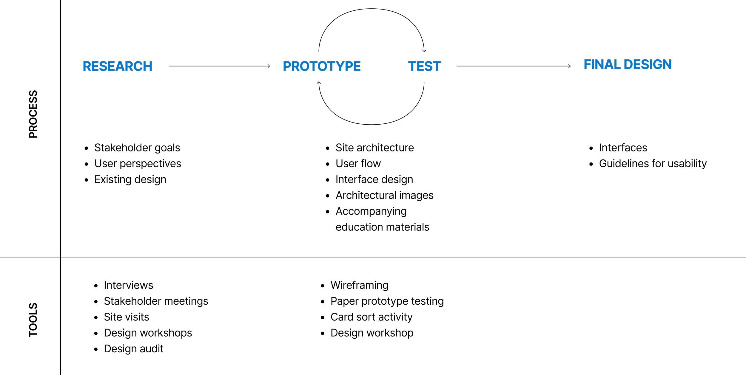
Research Process
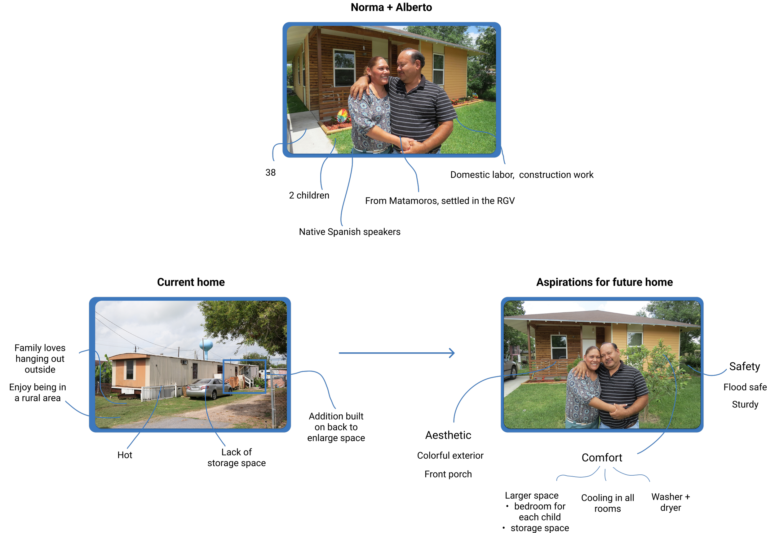
Clients of MiCASiTA are primarily low-income immigrants and are often living in houses that are too small for their families and have structural hazards. Many will build onto their homes over time as their families expand and they save for materials. More information on these building processes can be found here. Because of the state of many of their homes, clients are eager to realize their dreams of building a new home and have an abundance of ideas and aspirations. Bringing clients into the design process empowers them.
Users

We audited the existing platform with a focus on user flows, site architecture, and aesthetics. We discovered that the original site was designed to move the user through the creation of a construction spec document, which was confusing for clients and did not create excitement around designing their home.
Design Audit
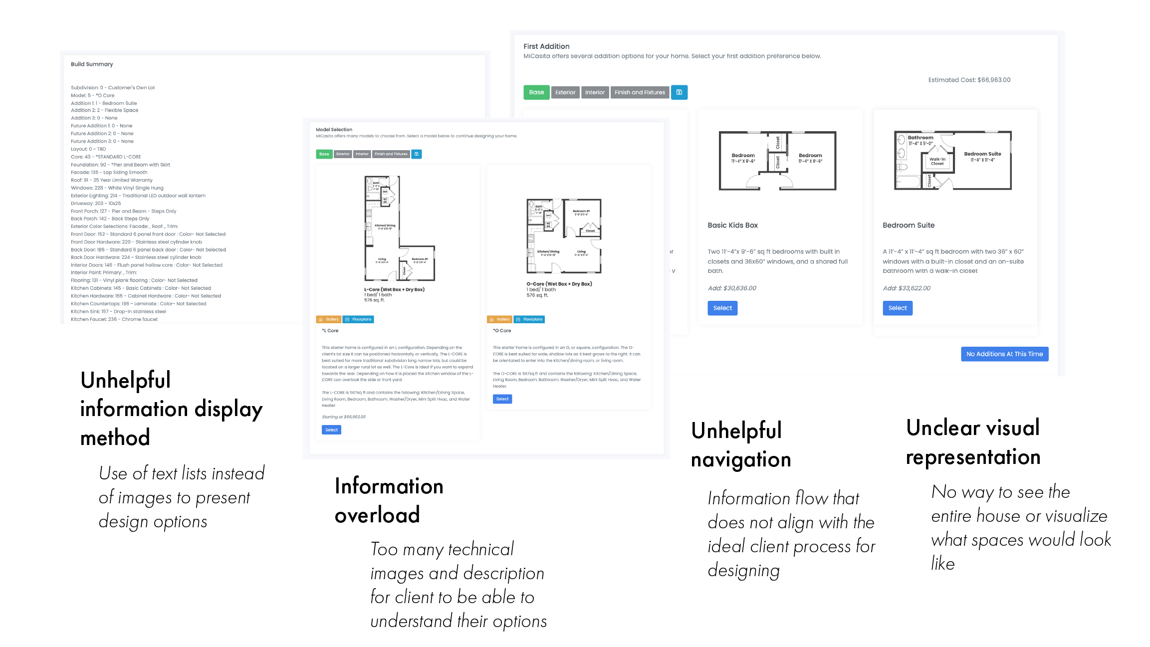
Primary Design Issues
The steps of designing the house were not clear for the clients
Images and text did not align with the ways that clients visualize a house
Design Process
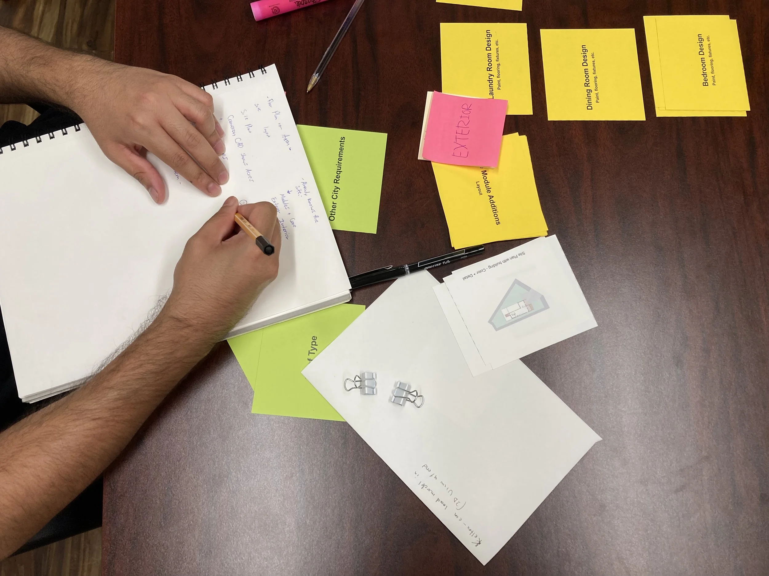
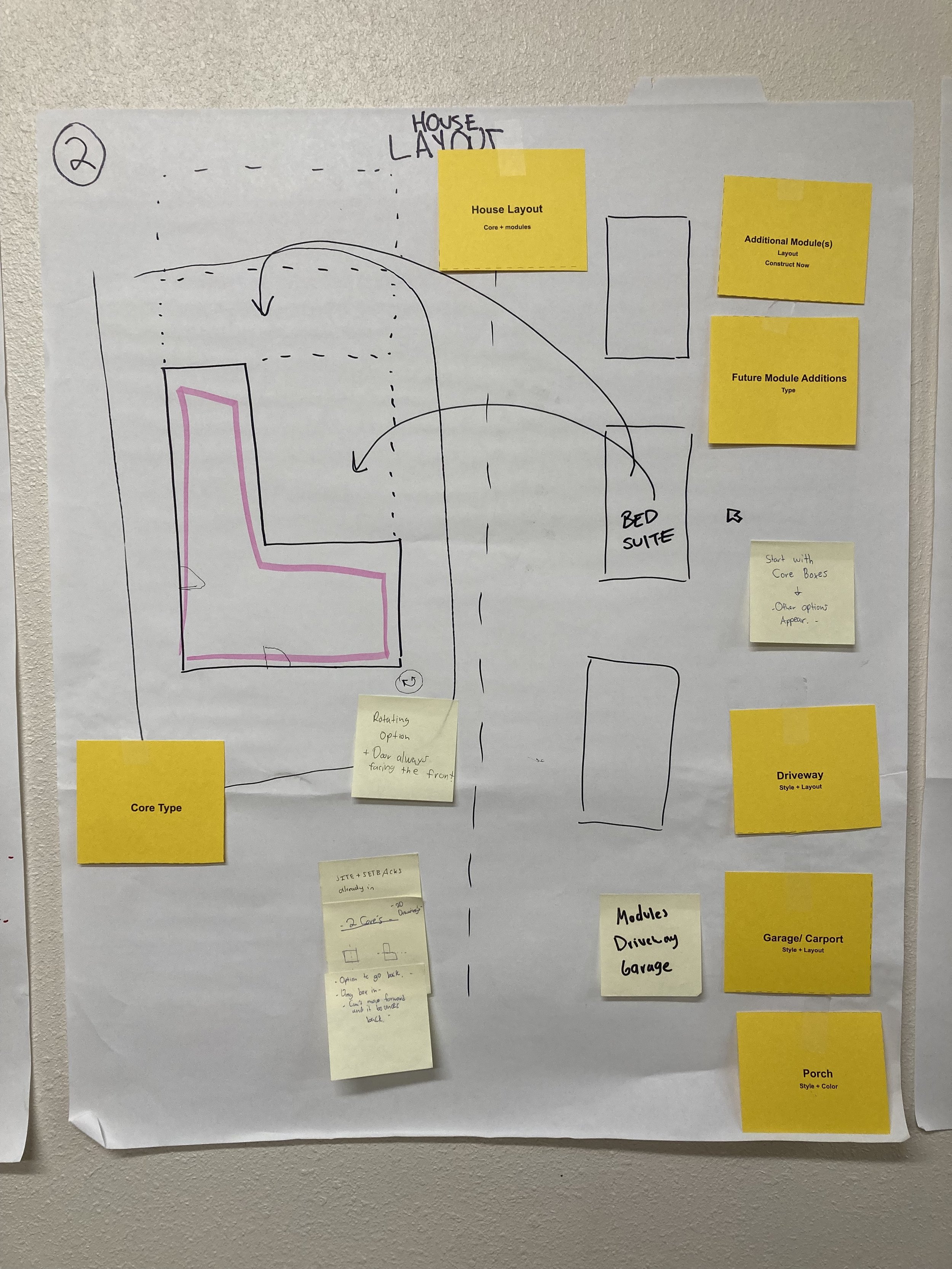
Using an adapted card sort activity, we tested with users to understand their ideal process for designing their home.
User flow
Primary insights
Clients prefer moving through the process as follows: Layout → exterior → interior. This feels like building the house from the widest to the most granular level of detail.
When picking finishes and appliances, clients prefer to do so by room as opposed to selecting for the whole house. This better allows them to imagine what their house will look like.
It is easiest for clients to understand the home building process when each choice they make is its own step in the process.
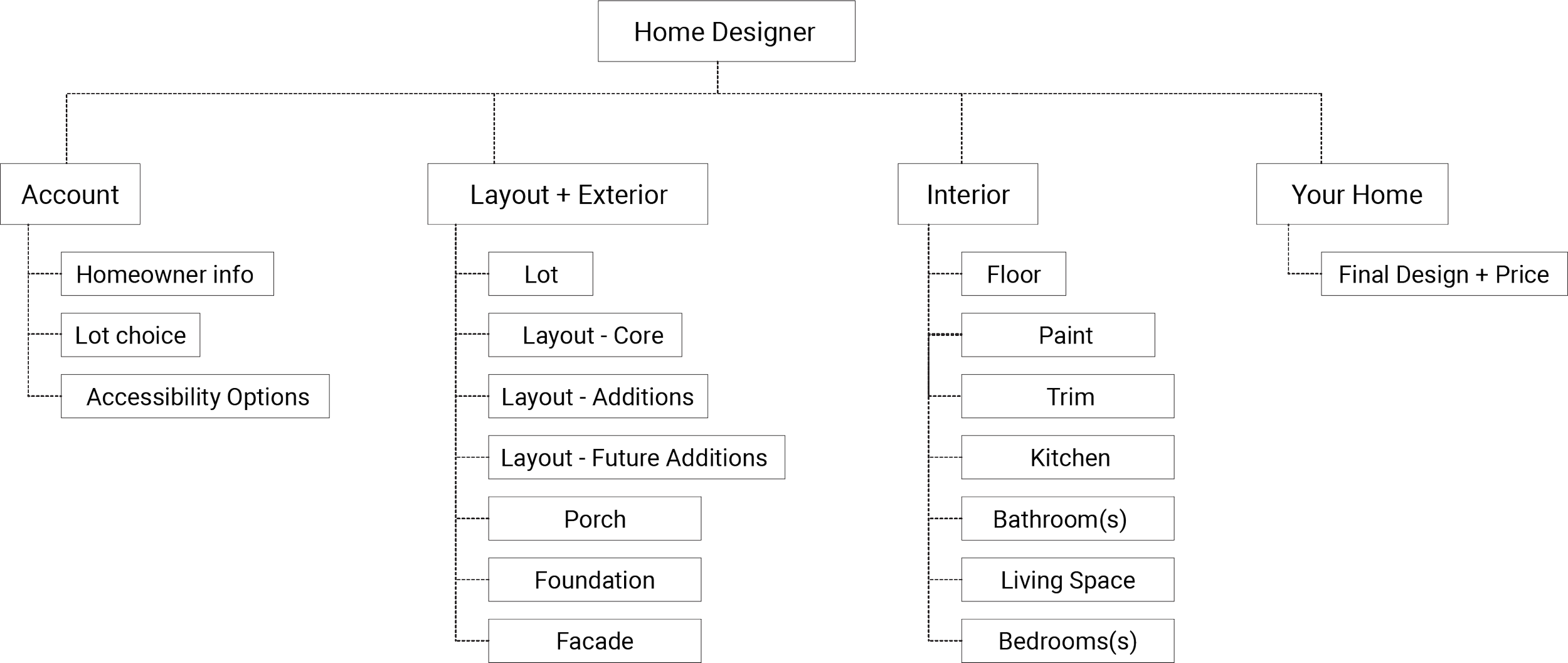
From these insights, we developed a new process for designing the home.
Site Architecture
We designed a new site architecture based on these insights.
Architectural Images
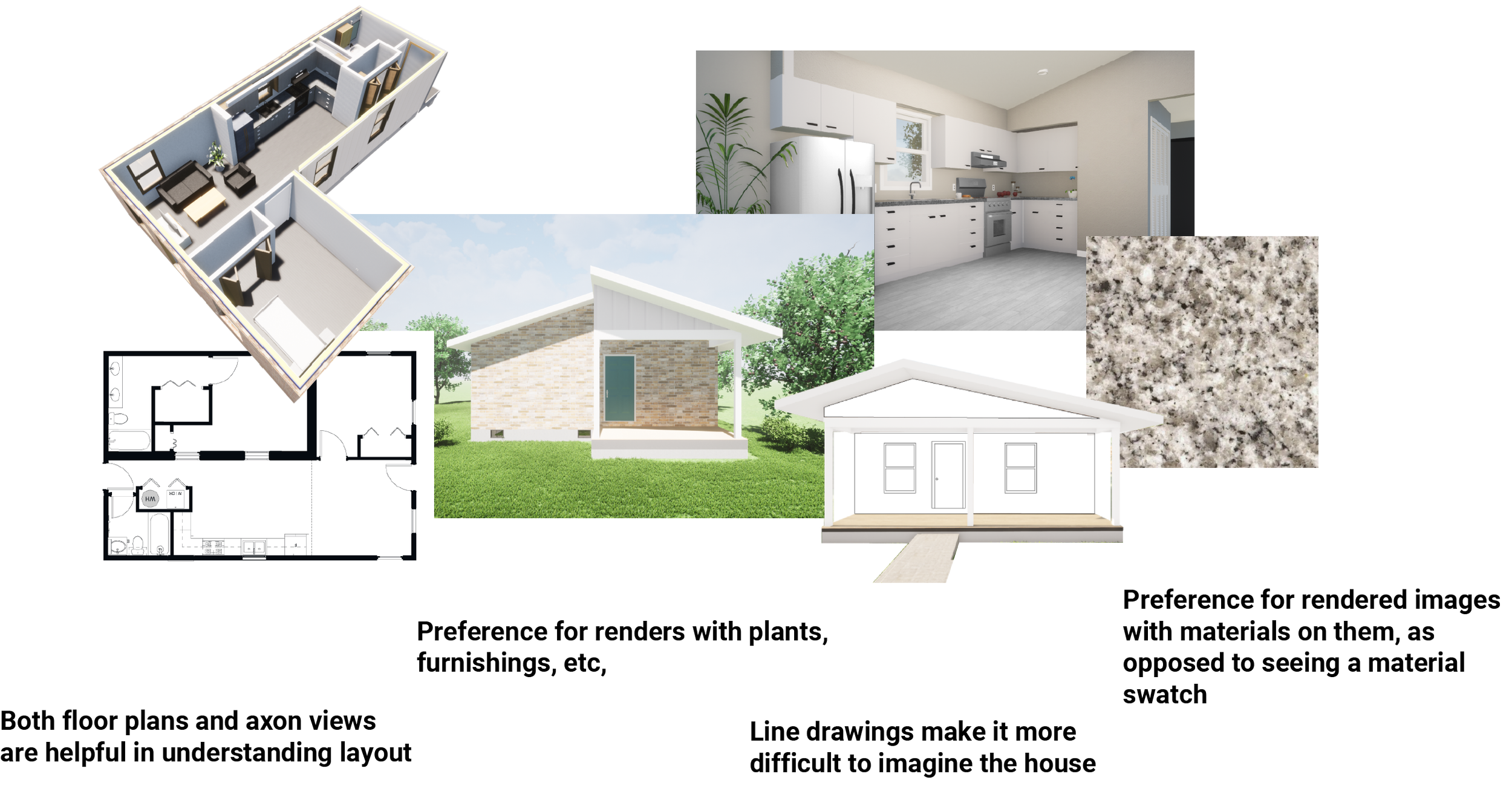
We tested various types of images and architectural drawings and renders to determine what was most understandable to the client. We found that it was important that the images look real (not diagrammatic), as a tool to help the client imagine their home. This means that standard architectural views and styles are not necessarily the most understandable for the client.
User Testing
Testing phase 1: Wireframes
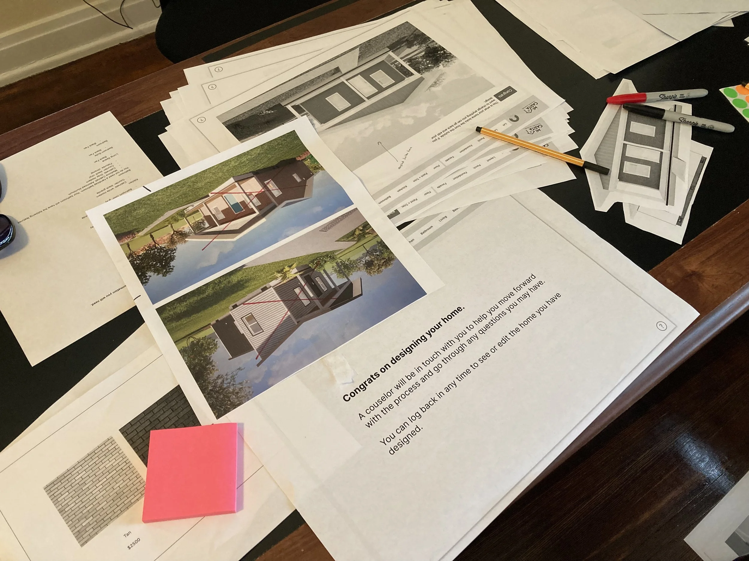
The first round of wireframes were tested in a paper prototyping exercise with clients, which guided our design principles for the site.
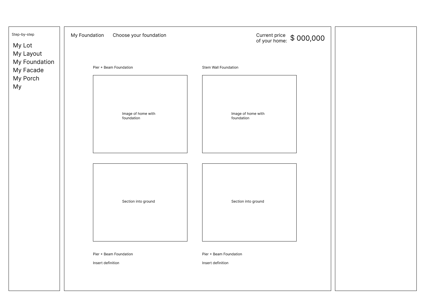
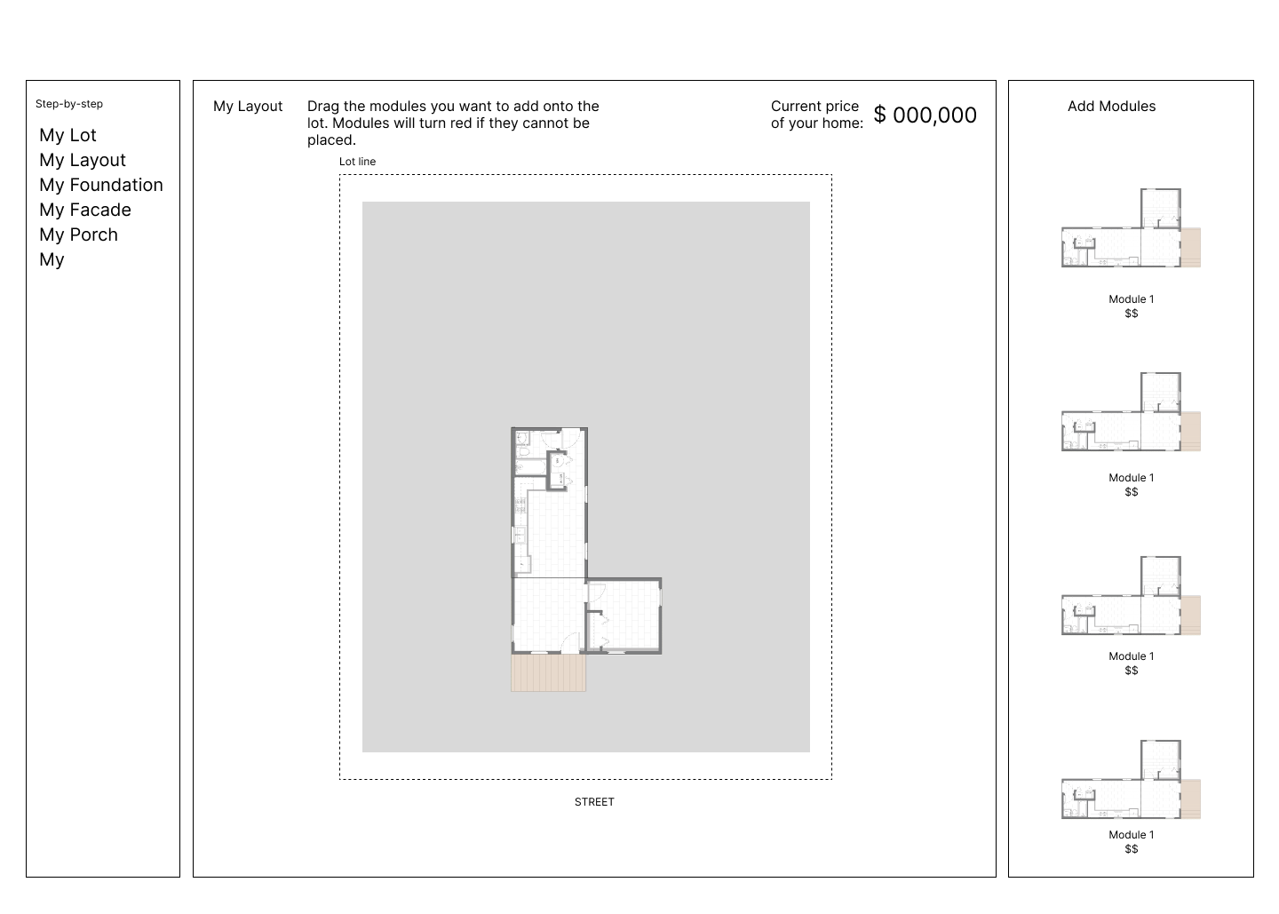
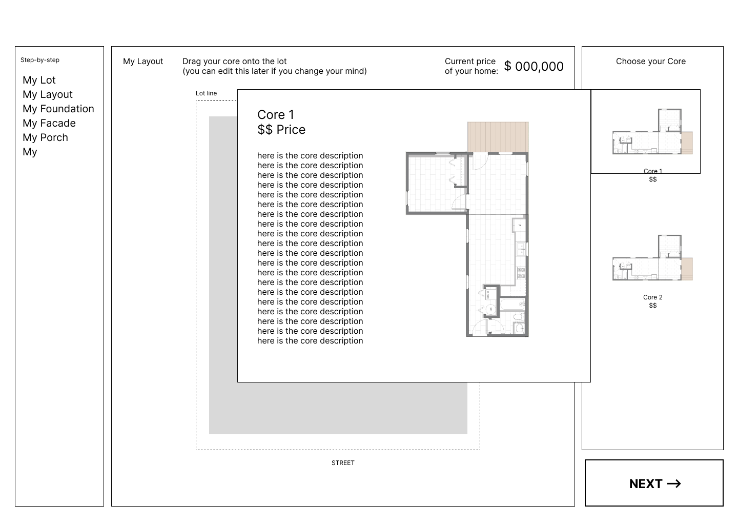
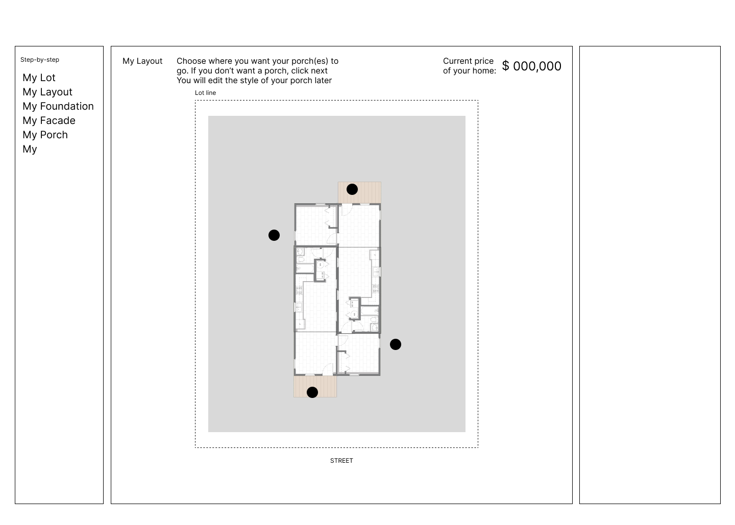
Insights for usability

Testing Phase 2
In the second round of testing we focused on user interactions with details of the site to refine menus and button placement.


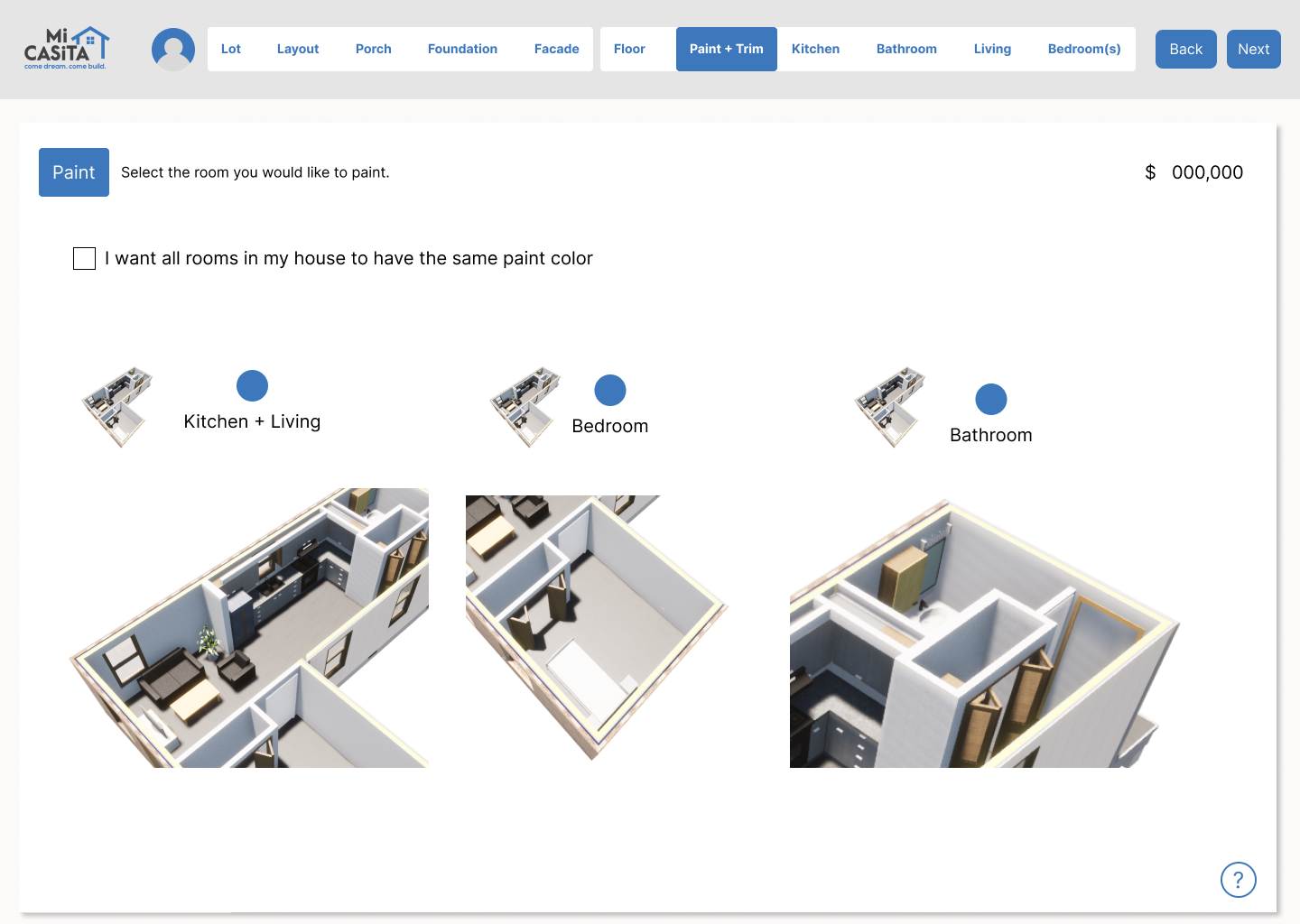
Final Design
Layout
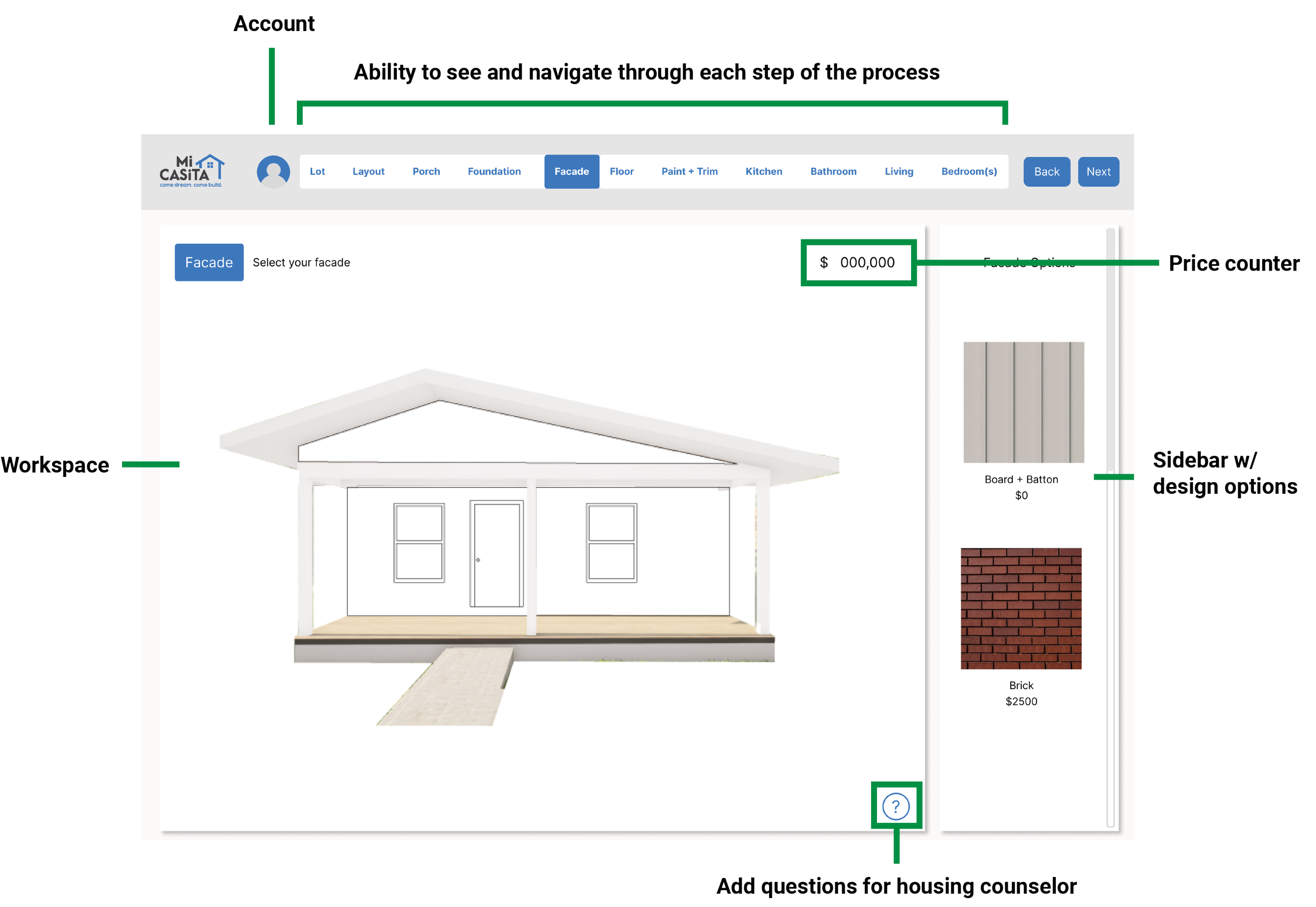
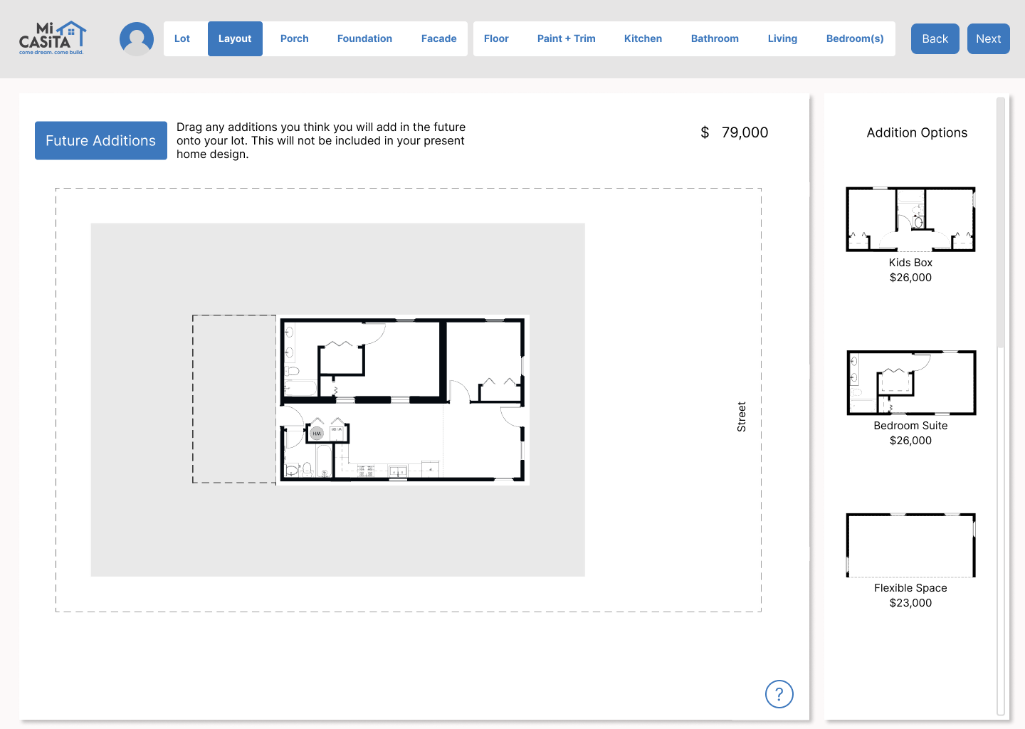
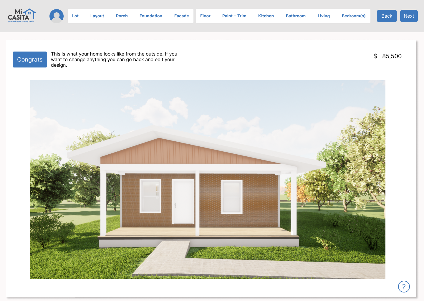
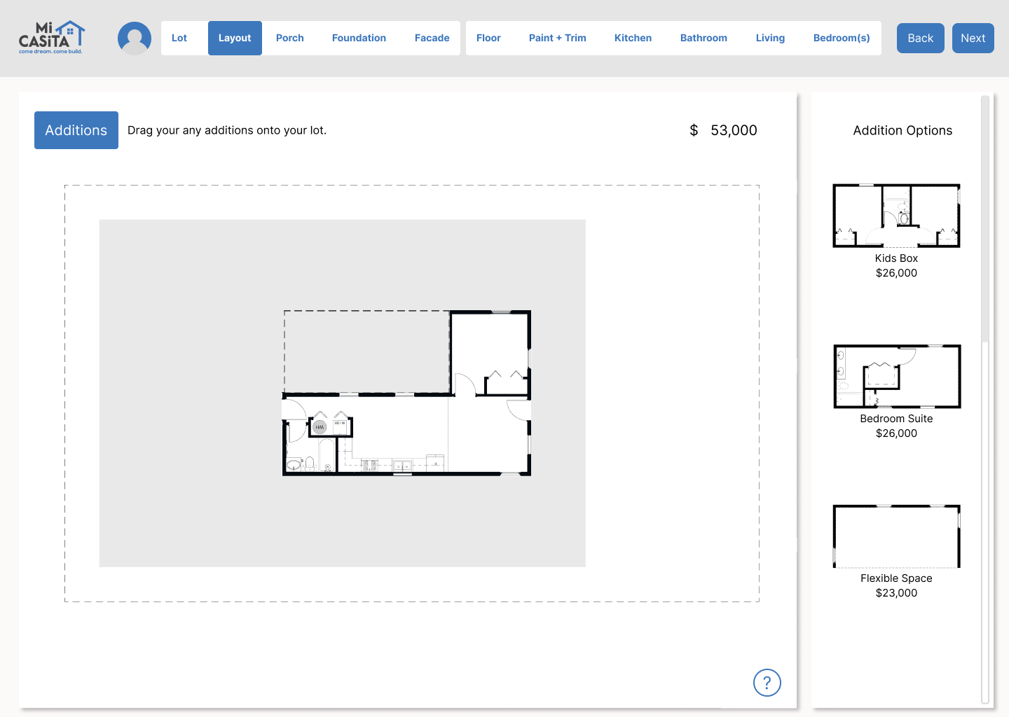
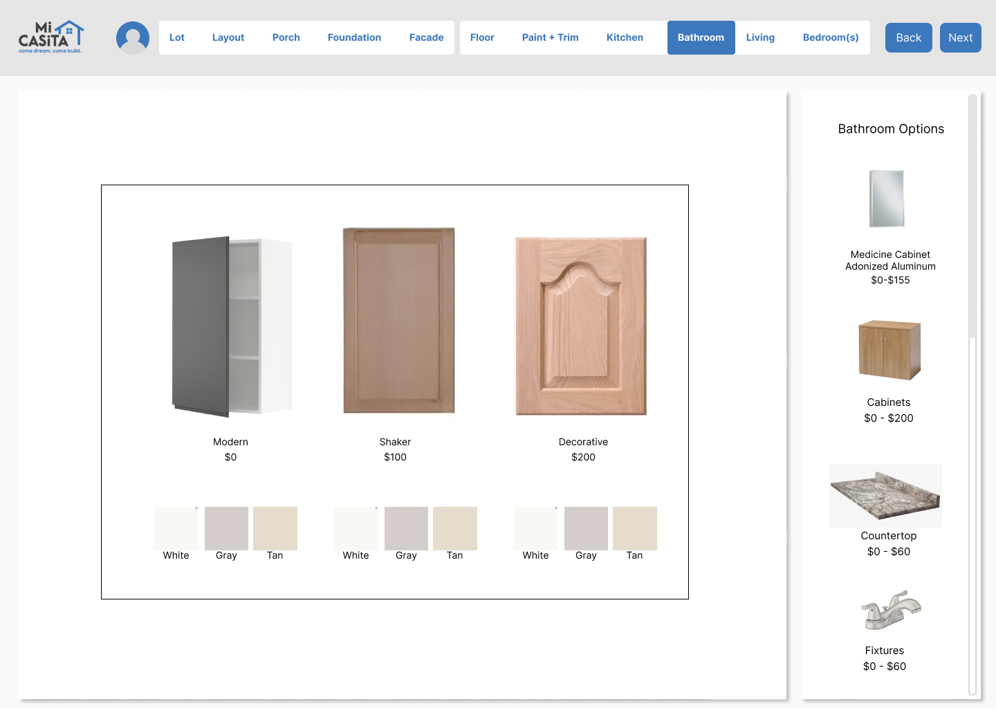

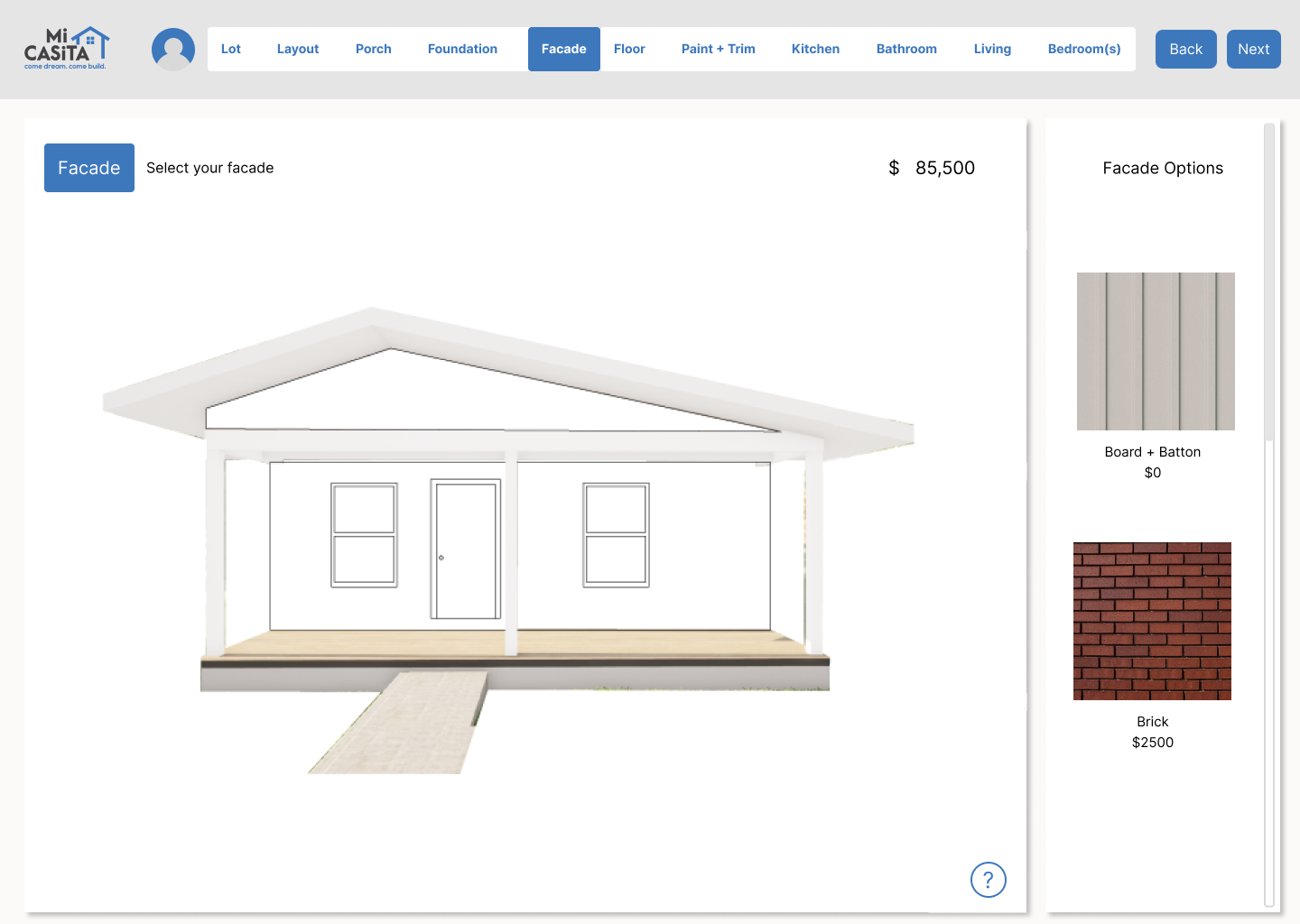
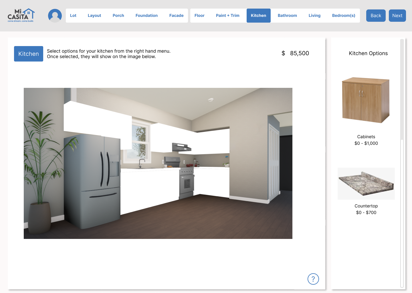
Key Features
Workspace
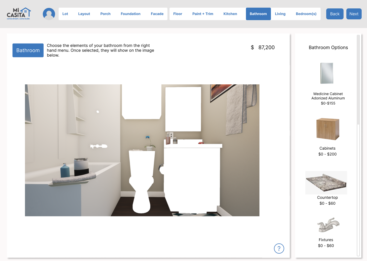
The central workspace shows live changes to both the view of the home and the price counter as the client clicks on different options.
Sidebar + popouts
When clicking on an option from the sidebar, more information on pricing and finishes pops up. This creates a flow of information that does not overwhelm the client.
Line drawing to render
As the client chooses finishes, appliances, etc., the image of the home becomes a render.
Learnings
Each user research method provides insights into a different layer of information. In this case it was as important to test the reception of individual architectural images through paper prototyping (in order to create understandable methods of representing the house), as it was to use card sorting to determine the flow through the site.
When designing for users with low digital literacy, it is crucial that information is tiered and/or hidden in the design (accessible through clicking, sliding, etc., but not all present on the same page), to create an interface that is encouraging, not overwhelming to the client.
Paper prototyping can be a hard method to use for those who rarely use the web as they may treat the paper as paper, not a mockup for a site.
When working on redesigning an existing site, seek first to understand the data structure of the site. This will allow you to integrate user needs and existing infrastructure from the beginning, saving you from a later mess.